
About
Within this project I was tasked to overhaul a chosen website's UI, taking a deep look into website design and how each button, section and layout should be formed in accordance to the product/service they are providing.
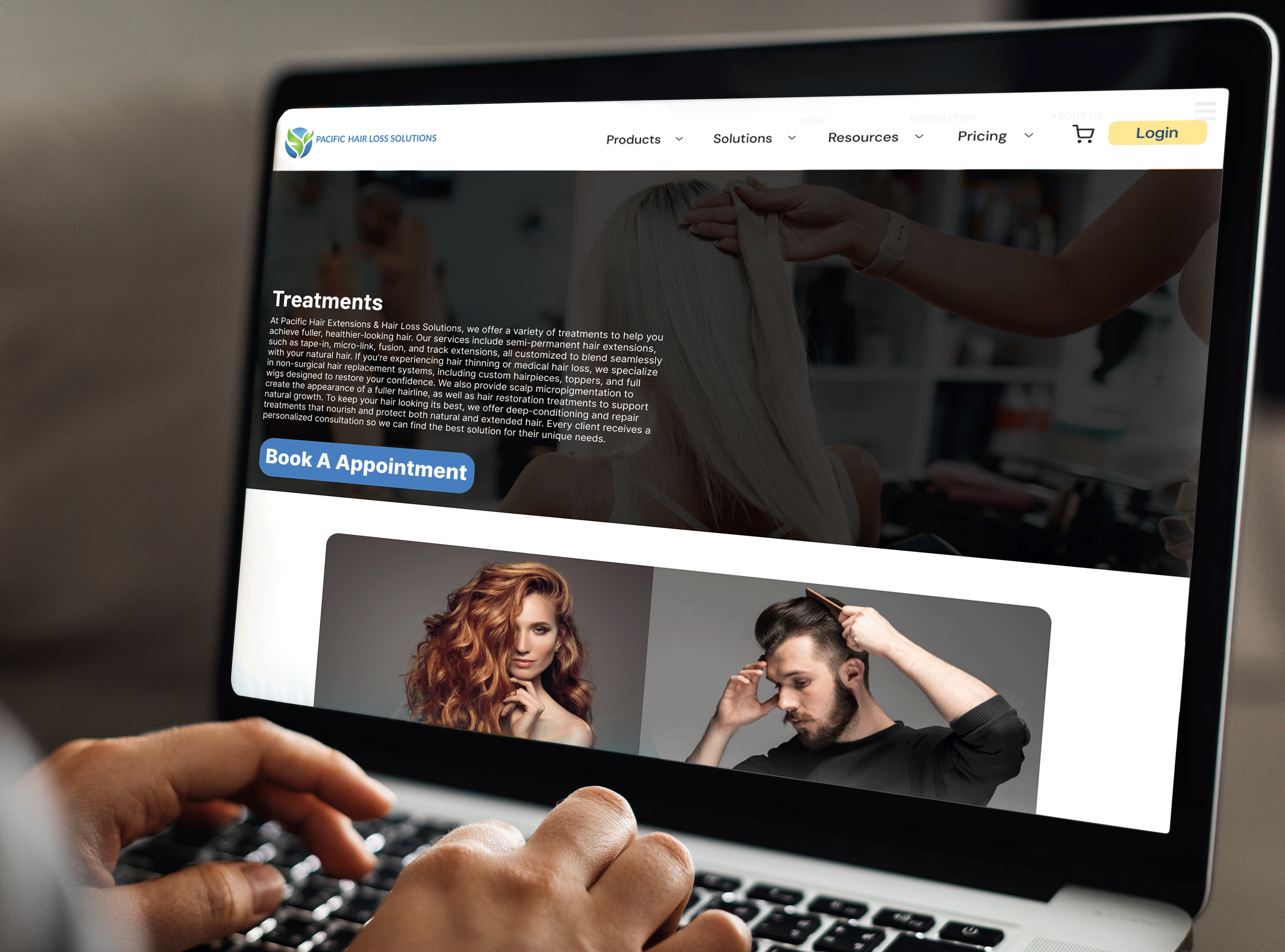
The chosen website was for a Haircare and extensions business, located in downtown Vancouver.

Problems with Design
1 : Overwhelming with graphics advertisements and full of useless imagery and information.
2 : Outdated low resolution imagery with too many different colours on typography and icons.
3 : Navigation bar is confusing with low colour contrast on the type against the background making it harder to read.
4: Information is scattered and no layout was followed.
Solutions to these issues
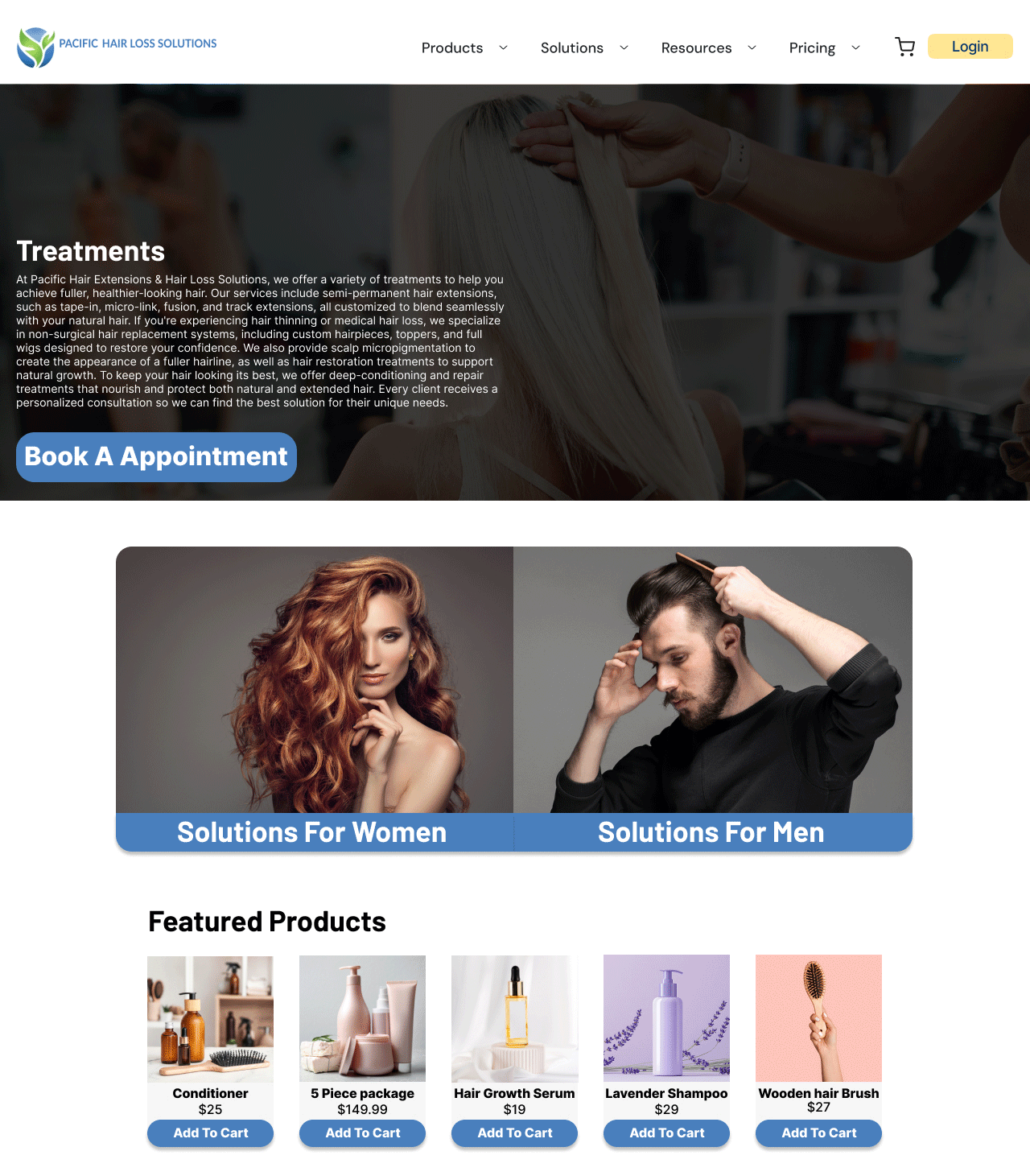
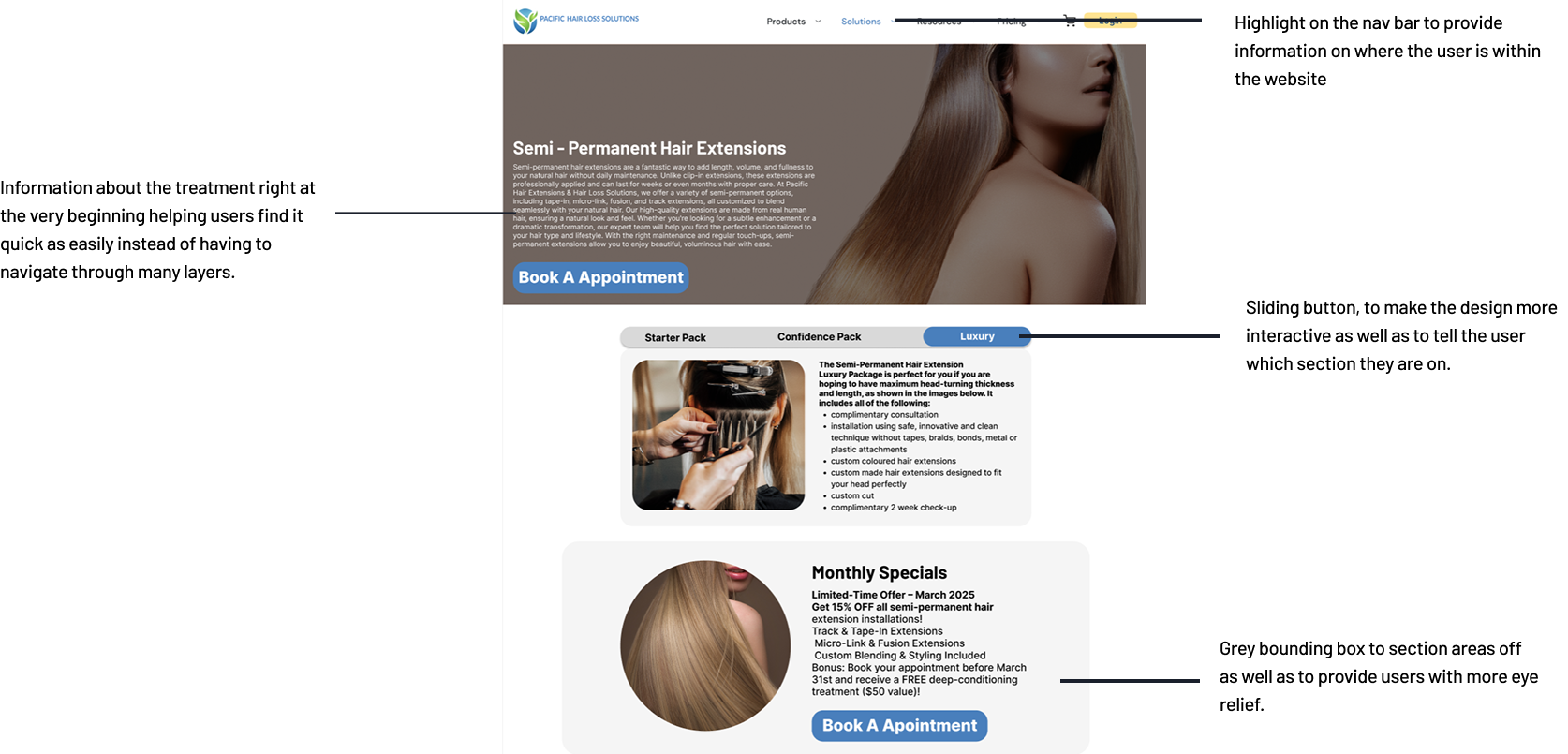
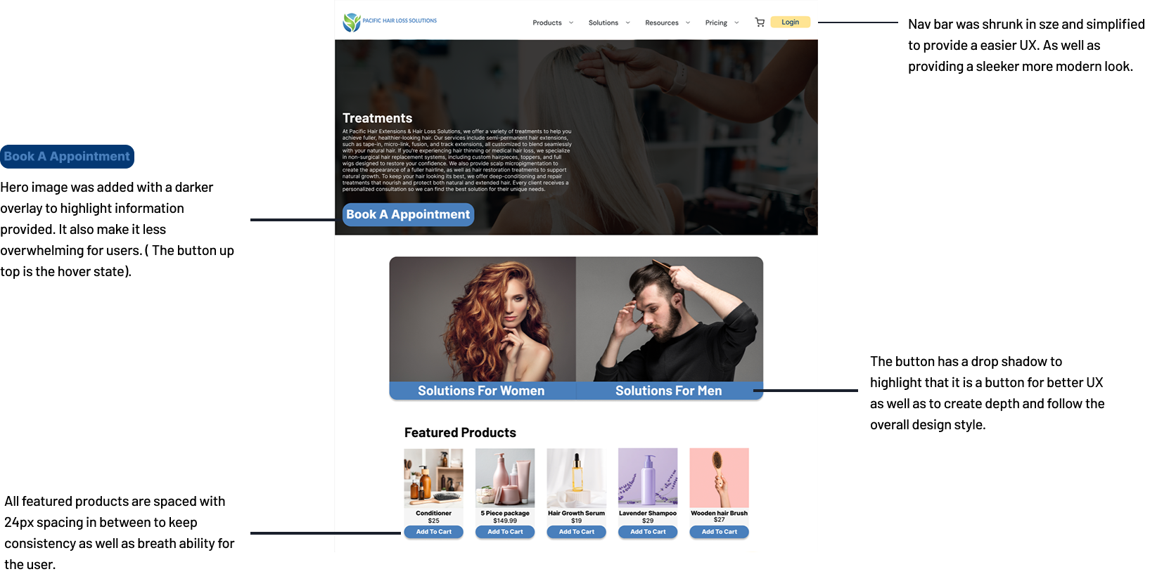
1 : Follow a simple layout to keep the design consistent and flowing.
2 : unify the website with icons buttons and simple yet easy to follow UI.
3 : Make the overall design more modern with a simplified layout to help the target audience navigate the website.
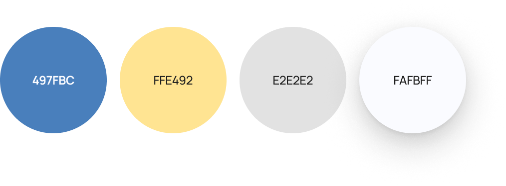

Colours
Colours were chosen to follow the previous branding style while providing a more modern and clean asthetic.
These colours are to be used to highlight or accent web buttons and icons. with the drop shadow being elusively for buttons / interactive elements of the website.
These colours are to be used to highlight or accent web buttons and icons. with the drop shadow being elusively for buttons / interactive elements of the website.
Iconography
Icons have been designed to be as simplistic and easy to understand as possible, as the target market is of a older generation.
Icons are to be used in collaboration with information, and put to the side of the information with a minimum of 5px spacing.
Icons are to be used in collaboration with information, and put to the side of the information with a minimum of 5px spacing.
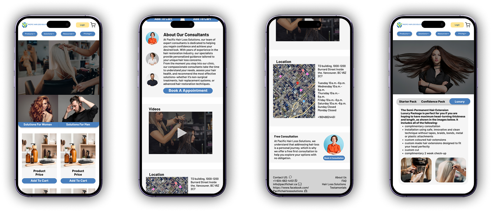
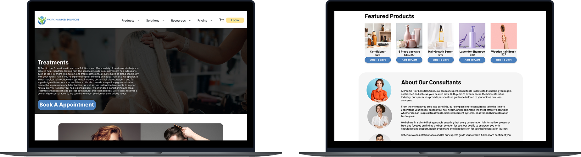
Mobile and Web Mockups
The mobile mock-up/design has the same exact core principles as the web redesign, with the basic principles of mobile design such as 4 column margins.
The purpose of these mockups were to provide a clear visual representation of what the website would look like in real life application.
Conclusion
The overall goal of this project was to improve upon and further develop the website of Pacific hair loss solutions. I believe I improved the website to a high degree by fixing a large amount of the core issues plaguing the website with complicated tabs and annoying UX. A big part of that process was to cut down the fluff and think through each process a user would go through for their first time on the website. The biggest challenge of this was to make the web and mobile designs feel cohesive while providing the same amount of depth and detail. Going through many revisions and redo's until I was satisfied with the end result. In the end I believe I was successful with this project.