Overview
This project was a total brand creation project. Starting with the location of the brand as well as a few options for the brand service/goods provided.
I chose an optical company within the L’Atelier building, located in the East Village location in British Colombia. The main goals of this project was to demonstrate my design abilities as well as creative skillset to come up with a compelling brand, and its imagery. While catering to a bilingual community of Korean speakers.
This project was a complete brand creation project, starting from name and logo creation to Graphic standards manual of the fictional brand. Going into comprehensive detail on the brand’s story, mission, goals and more.
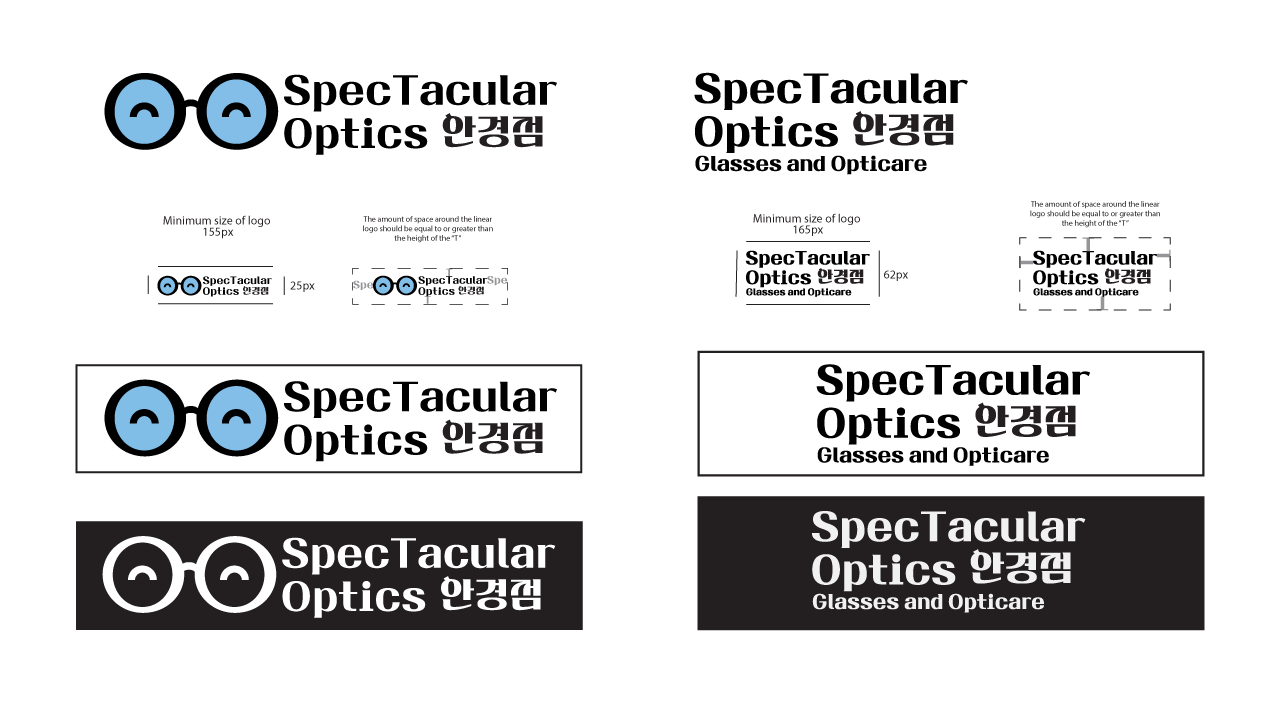
Logos
These are the Primary logo and the wordmark logo. Within each design I kept the simplicity of the iconography, making sure the main imagery is obvious and easily understood by viewers. As well as including Korean typography, running it through native speakers to make sure it is still highly legible and user friendly. I also chose JTT하얀새OTF Regular As my main logo typography as it is designed in a way that is : highly legible, clean with a high contrast and strong alignment with the Korean characters. Working with the core brand goals and needs for the business.

Colours
The primary colours chosen for this design are: Lens Blue and Sunny Yellow. These were chosen as they provide a warm and appealing tone to the brand's core image as well as strong unique recognition. Blue also correlates with the aspect of trust and reliability within brands.
The secondary colours are Violet Purple and Nature Green. These were chosen as accent colours as they complement and work well with the primary colours to keep a cohesive and simple design.
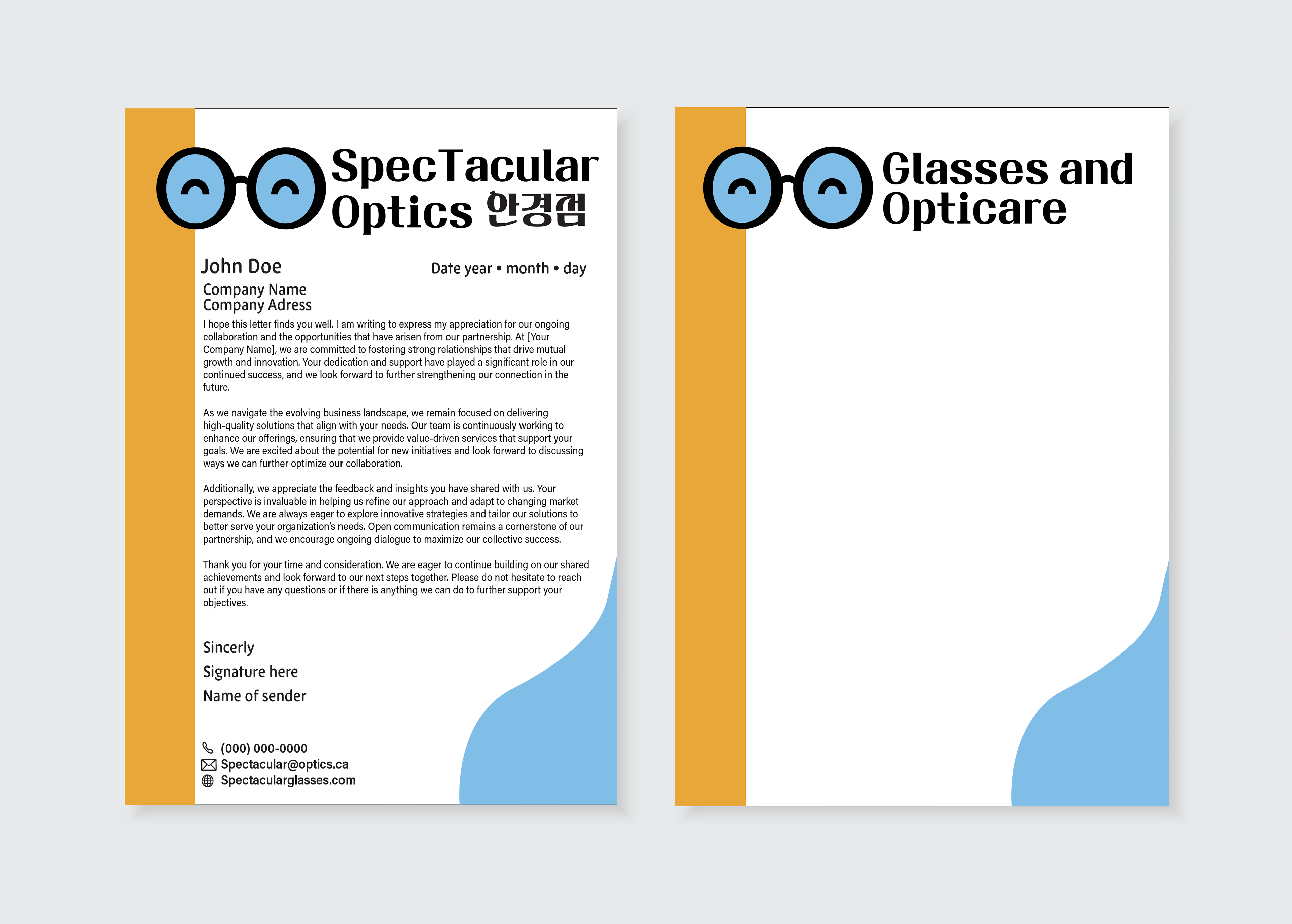
Stationary
This project involved creating a clean, modern, and bilingual letterhead for SpecTacular Optics, a professional optical care brand. The design showcases a friendly, approachable aesthetic while maintaining a polished and corporate tone.
The top left letter head prominently features the SpecTacular Optics logo, which includes playful eyeglasses with eyes, communicating friendliness and clarity key elements in optical care. The logo includes the Korean translation (안경점 meaning Optician) to emphasize the brand’s bilingual accessibility.
The left Second sheet Follows the design of the letter head while keeping it blank for later needed information added.
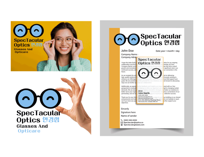
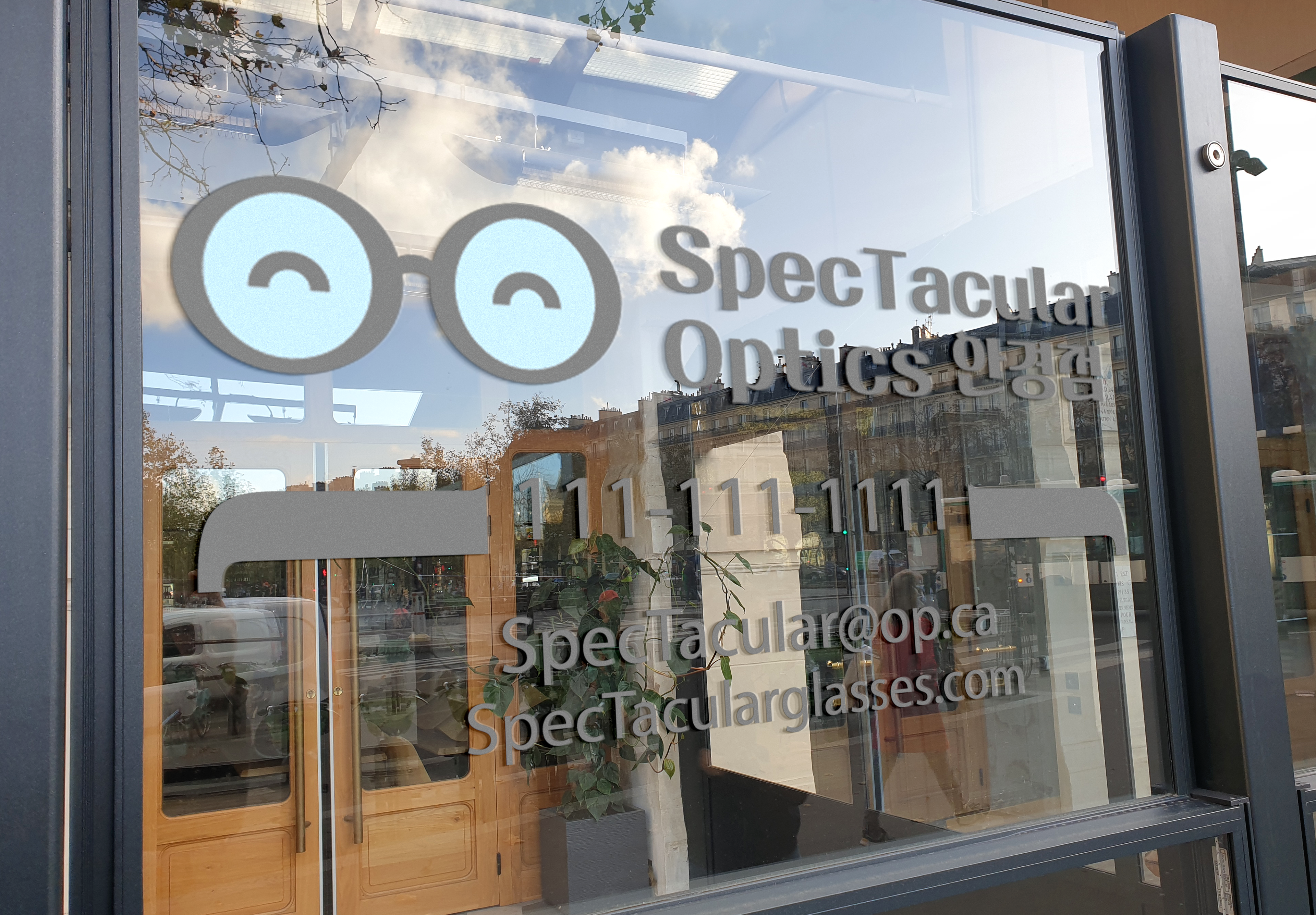
Advertisement and Business Card
This visual identity expansion for SpecTacular Optics showcases a cohesive branding rollout through an ad concept and clear business card . Each design element has been fine tuned to maintain brand consistency while appealing to a diverse audience with a playful yet professional tone.
Within the ad campaigns I wanted to keep the simplistic design approach, bringing the logo into the ad as a dynamic graphic while getting the brand imagery across.
The right side features the full business stationery mockup, combining the branded letterhead with a close up view of the business card design. The card keeps things sleek and minimal: the logo sits front and center, and contact details are presented clearly underneath.
Within this design I chose for it to be made up of a clear acrylic material staining it with a white sheen around the design to keep text and icons legible. The only areas that are clear are the glass frames within the logo itself, bringing a playful and creative nature to the design.
Conclusion
In this project, I had the creative freedom to explore experimental concepts with minimal constraints, allowing me to push boundaries while keeping the design visually simple and culturally considerate due to its bilingual nature. A key challenge was creating clear, accessible graphics and choosing a typeface that balanced style with legibility in both English and Korean. This involved extensive trial and error, including feedback from fluent Korean speakers to ensure clarity and cultural sensitivity. While I’m proud of the final result, given more time, I believe the brand could be refined even further.