Project rationale
This project involved designing a sustainability report for a selected business, with the goal of transforming a traditionally text heavy and visually dull format into an engaging, well-designed document. The primary focus was to apply strong, intentional design choices to enhance readability and visual interest, all while staying true to the company’s existing brand guidelines. The challenge was finding a balance between creativity and clarity ensuring the report remained professional and informative.
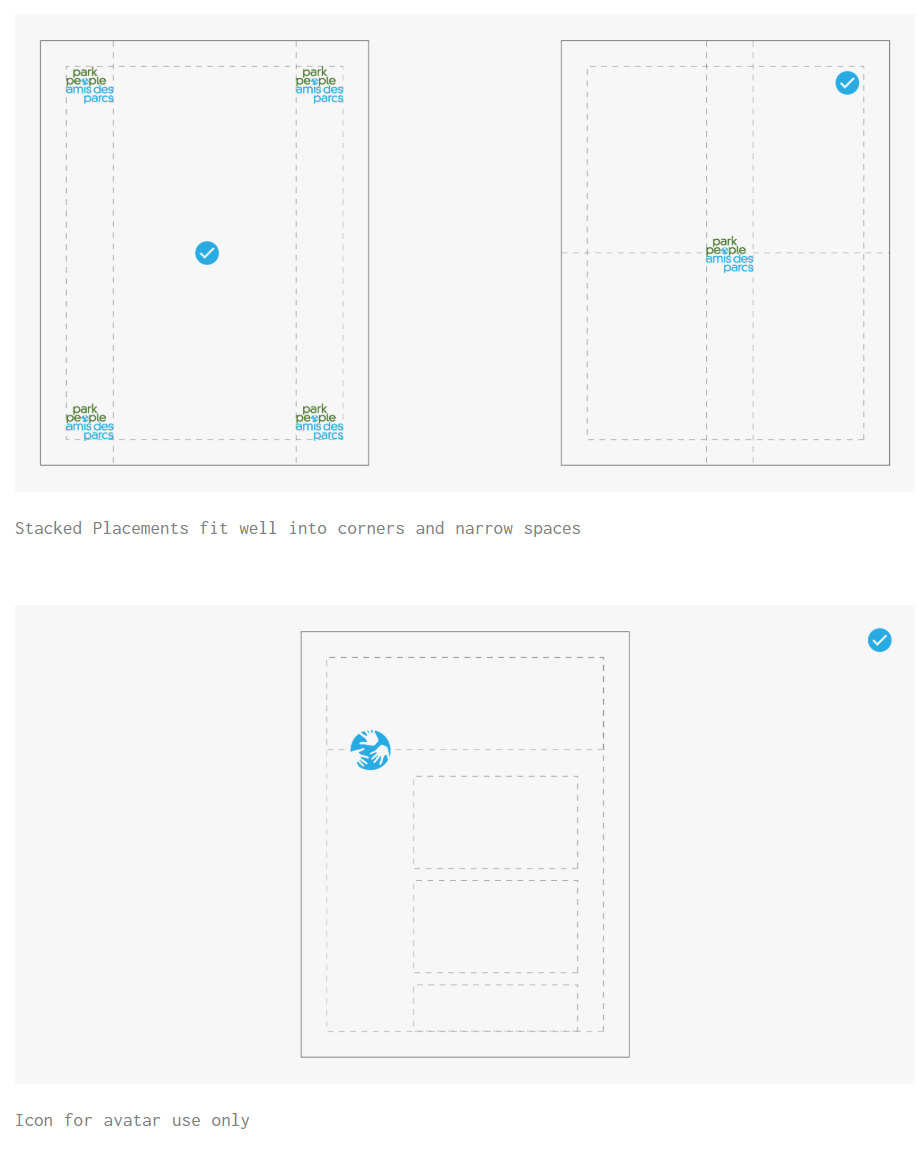
Logo Guidelines
Overview
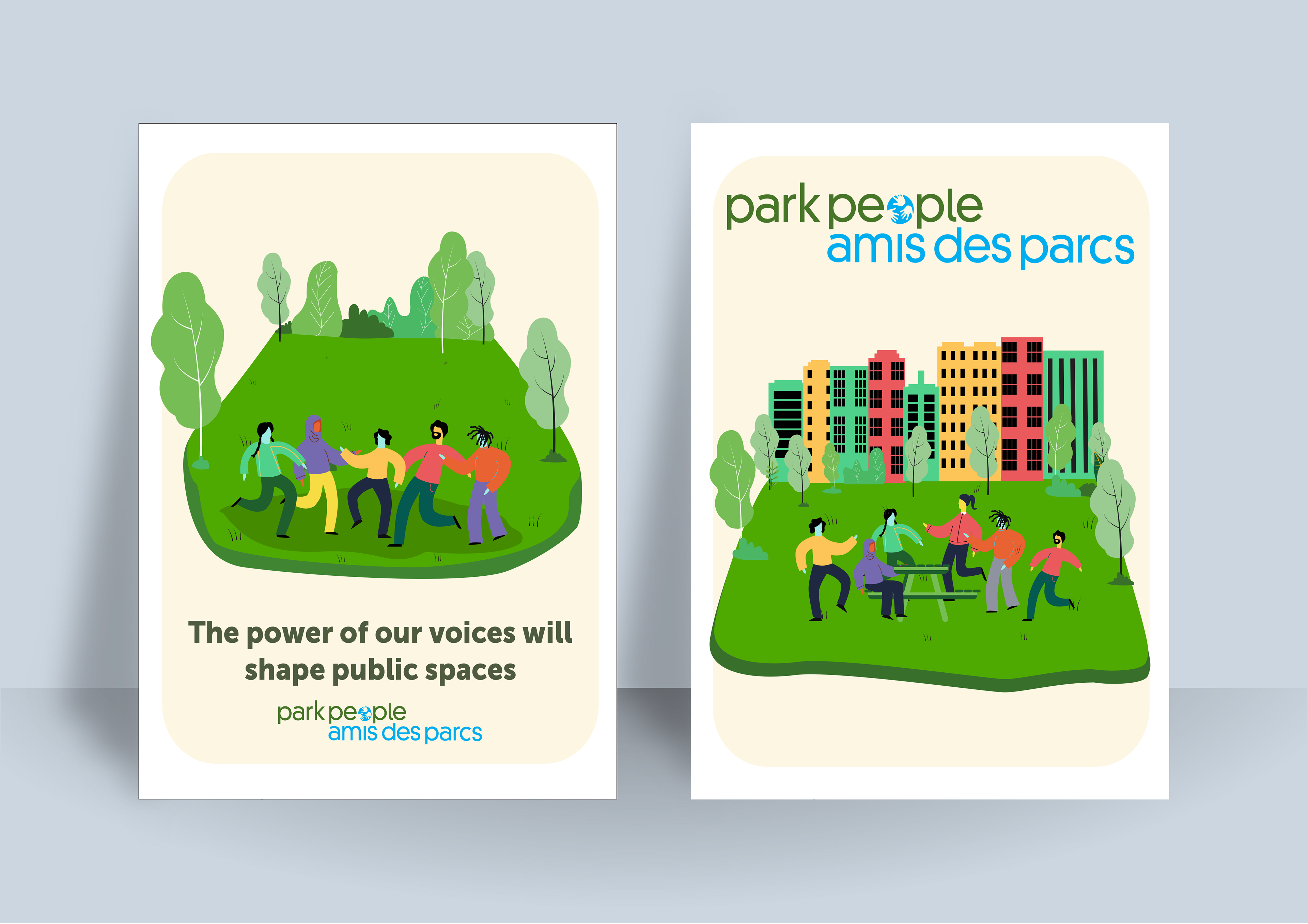
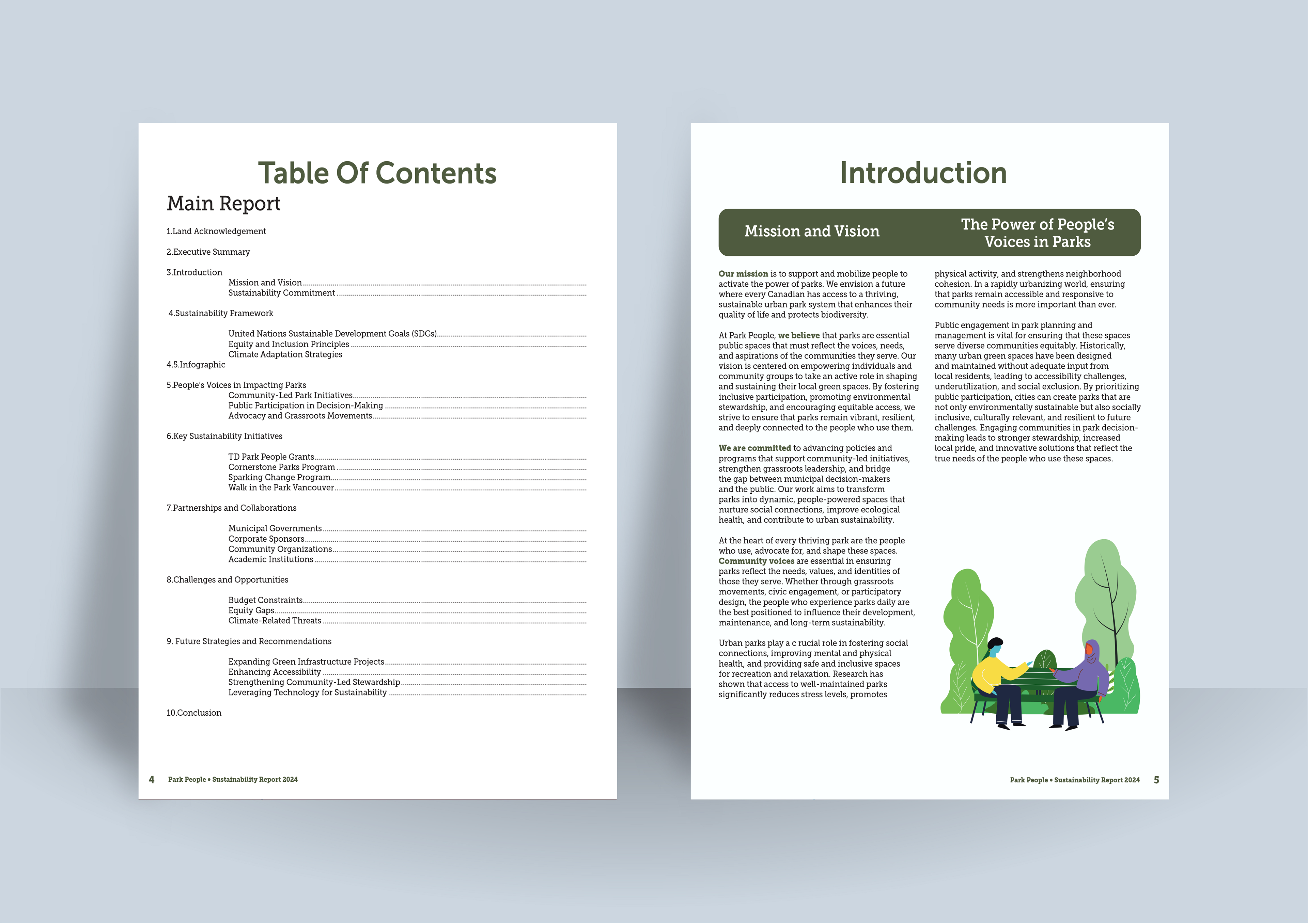
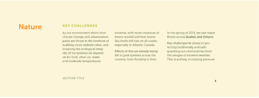
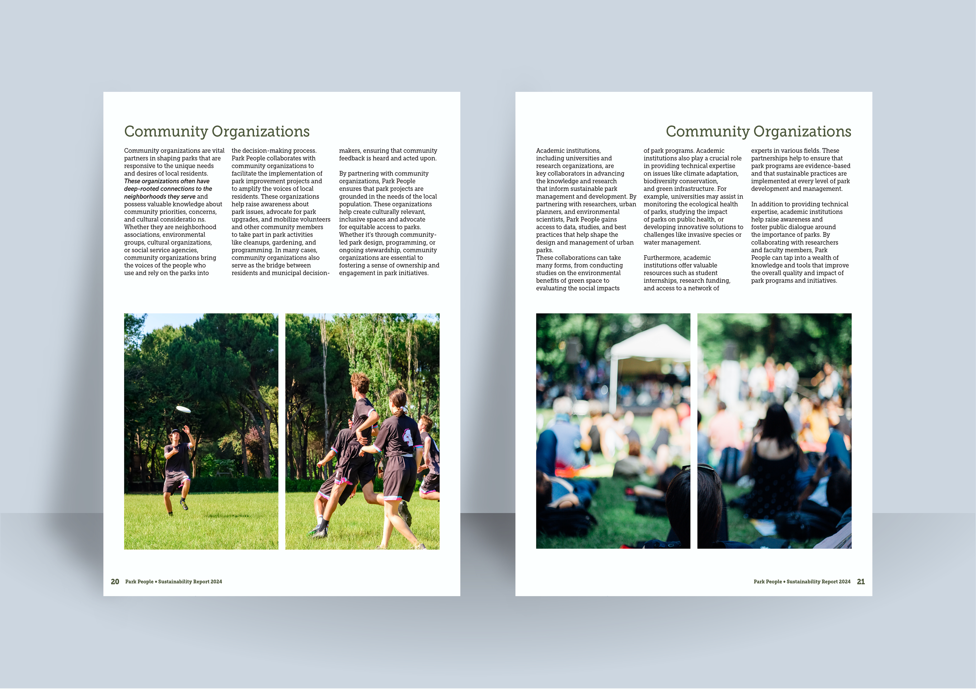
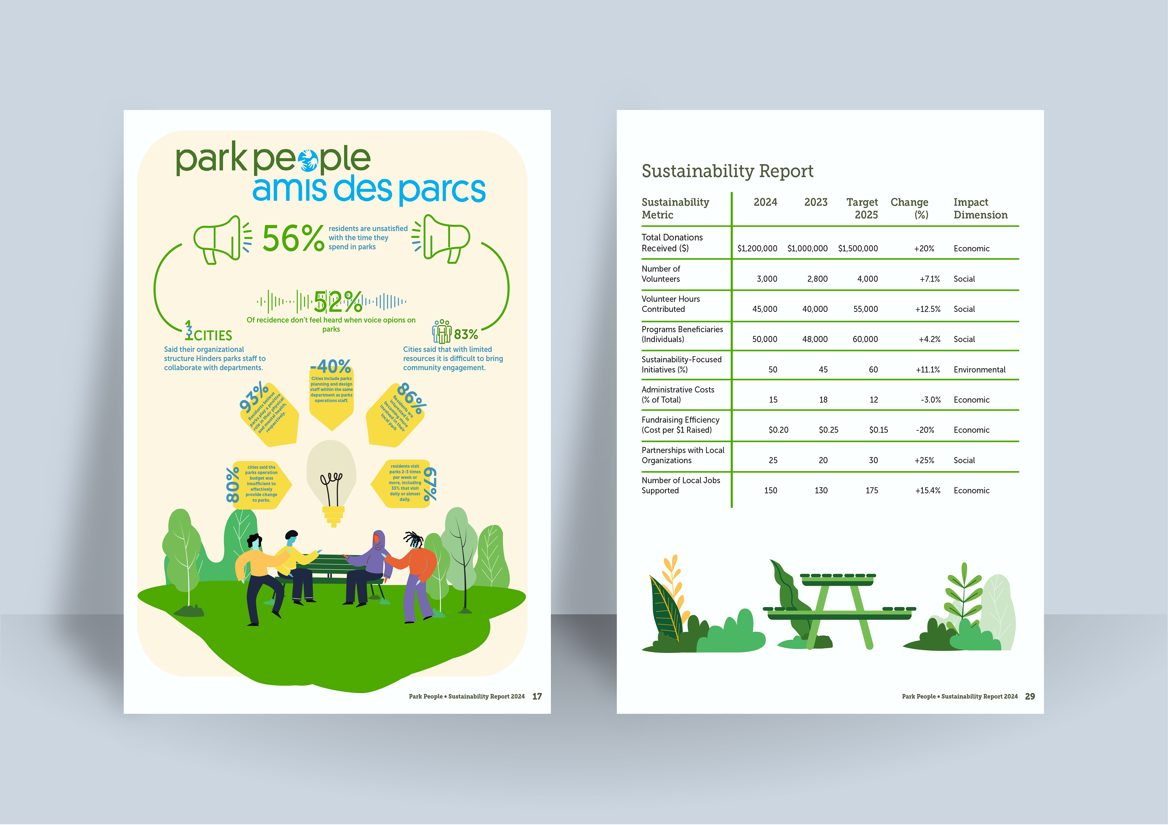
The pages here are some examples of spreads that i designed involving heavy text and information as well as simple graphics that follow the previous years graphics for their sustainability report. The main design choices i had with these was keeping the word per line limit at 75 words a line. This was done to keep the type from feeling overwhelming for the reader as well as keeping it digestible and easy to pick back up.
typography Guidelines
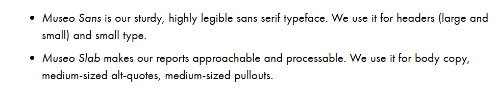
The primary typefaces used in this project were Museo Sans and Museo Slab, which were part of the brand’s existing visual identity. While these fonts are clean and highly legible, their standardized and minimalistic style presented a creative challenge. To maintain visual interest, I placed greater emphasis on layout, spacing, and supporting graphic elements ensuring the design remained engaging while staying within the boundaries of the brand's established guidelines.
Conclusion
One of the biggest challenges in this project was finding the right balance between presenting key information clearly and creating a visually engaging, easy to read layout. Adhering to the brand guidelines added both structure and constraints, which at times helped guide decisions but also limited creative flexibility. I overcame these challenges by gathering feedback from peers and stepping back to critically assess each design element ensuring every choice had a clear purpose. With more time, I would refine the graphics and fine tune certain page layouts to further unify the piece. Overall, I’m proud of the final outcome, and this project significantly deepened my understanding of large-scale document layout design.